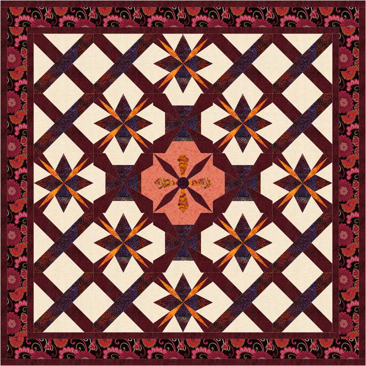
Very interesting design, and I like the large print fabrics for borders.

I love the way the pieced blocks have become part of a very different border design. I should try that sort of thing more often.
read more
Very interesting design, and I like the large print fabrics for borders.

I love the way the pieced blocks have become part of a very different border design. I should try that sort of thing more often.
read more
Unusual, interesting and eye catching!

My comment is the same as the first, but with different added!
How to quilt the light areas in the second is a good question.
read more
Exciting!
Not very often I say that about any pieced quilt design, real or virtual, but that was my first reaction looking at this one this morning when I had decided to use this project file for today’s virtual designs.

Second design is ok, but not exciting.
read more
Not too sure whether I like the colours or not, but do love the fabric designs, and the colours work in the design.

Too much white in the second, but I like the design overall.
read more
I like the first offering for today.

I like the second one more.
By the way, the Hi 5s in the title of this project file refers to the grid on which I drafted the blocks.
read more
I like at least some applique in quilts, along with room to show off some quilting. The first design today lacks applique, but I love it. Perhaps I would applique those pointy stars, and I know I would at least applique the centre circle.

Another very interesting design. The white highlights really add some sparkle to these designs.
read more

Two versions of the same design with a slight change in the placement of the light background.

The one above is interesting.

Love the last!
read more